Wednesday, December 14, 2016

Final Project: Artistic Response Visual Analysis

          For my final project, I took a modern war image and recreated it with Joan Miro's style. I used his painting, Personages Attracted by the Form of a Mountain, as style inspiration for my new rendition. The picture that I recreated was an image from the Syrian Civil War. I used an image from the Syrian Civil War because his inspiration for Personages Attracted by the Form of a Mountain came from the Spanish Civil War so I wanted to keep the central theme constant. Although you cannot see it in the image I selected and Joan Miro's painting, war in 2016 is much different than it was in 1936. There is new technology for weapons that make mass destruction easier than ever. The largest part of my painting is an image of a broken down tank. This shows how easy it is to take down a massive piece of machinery in this day and age.
           The focal point of my piece is the tank. From there my eye follows the barrel of the tank, to the frame of the building, down to the rubble then, back around again. I used the rule of thirds when creating the painting: the house remains to the left, the barrel and figure in the middle and the tank to the right. There are four figures on the tank: two of them look like they are playing on the tank and the other two look like they are just watching. I kept the colors the same as Miro's painting in order to clearly make the connection between the two pieces (primary colors, green, white and grey). I made things disproportionate in order show off  his original style as well as to make the more important aspects more noticeable. I also used a little more abstraction with the remains of the bombed house to the left and the rubble below.
          The connotation in this image is slightly chaotic and playful. The feeling of chaos comes from the hectic stokes of blue paint in the sky and the splattered and "messy" grey strokes below. The shapes of the cutout paper are harsh, not clean, which makes me think of rocks or remnants from an explosion. The white cutouts to the left are also messy and are frayed at the ends which again make me think of chaos. I get a playful feeling from the two figures that are swinging from the barrel of the tank. It is as if the kids are playing on the tank. The actual tank makes me nervous and reserved because it makes me think of all the different wars. The pain and struggle of people going through these wars also goes through my mind. The contrasting emotions of chaos, turmoil and playfulness remind me of the saying "its all fun and games until somebody gets hurt". The "fun and games" connects to the figures playing on the tank and the "until somebody gets hurt" connects to one of the figures getting hurt or the place that they are in: a war zone. That also reminded me of when I was younger and I would be playing in an old sand pit (somewhere we weren't supposed to be). The place that I was in was very dangerous but I overlooked this in order to play. This same idea applies to the image: the kids are in the middle of a war zone which is dangerous, so they are overlooking this in order to have a little fun.
          The ideology of this painting is that war is creating a lot of turmoil all over the world. Conflicts between countries and nations are slowly destroying our lives and the lives of our children. War is becoming a norm for the youth all around the world. Since it is a norm, they learn that violence and war is the only answer to things, which is not true. Another thing that is becoming a norm is people not understanding the true reason for war. This goes along with people not being open and accepting of people that are different. Each race, ethnicity or religion thinks that they are superior, so when somebody challenges that, "all hell breaks loose". The figures in the painting are supposed to resemble children. Having children playing on a tank shows that they do not understand how harmful that piece of machinery and war can truly be.
          By using Miro's style on a modern image, it made me realize how he emphasizes ideas that are important to him. It also allowed me to see how he was able to detach emotion from his paintings. The original picture that I picked to recreate is hard to look at because of all the ruins and destruction, but in the recreation it is a lot easier because figures are distorted with semi-abstraction.

Original Syrian War Image

Personages Attracted by the Form of a Mountain

Children Attracted to the Form of a Tank

Wednesday, November 16, 2016

Fragile Vessels: Julio Fine Art

          Last night, I attended the presentation Fragile Vessels by Cheryl Derricotte and Nate Lewis in the Julio Fine Arts Gallery. There were two types of art present, glass pieces and paper pieces. Despite their different mediums, the stories behind their work is similar: they did not plan out their work, they just went with it. 
          Cheryl talked about how she took a glass blasting class. In this class she created a ship and thought that it looked "ghostly": this is where her inspiration came from. With this idea in mind, she searched "ghost ship" in the thousands of pictures that the British Library had just released and found images of the global slave trade. She etched these images into glass and created her exhibit using multiple images in a row to tell a story. Her work is going to go on display in the Museum of the African Diaspora where she was recognized as a new Emerging Artist. 
          Nate started his story by telling us how he was a nurse in the ICU. As he continued, he said that he started off using the electrocardiograms from his patients as his medium and inspiration. From there he was inspired from the idea of multi cellular living that was present in all of his patients. He took this idea to plain paper and a pen and drew simple designs. He then switched to a knife and made cut outs, lines and scratches. The marks he made with the knife were intimate, just like the relationships that he had with his patients and he wanted that to be clearly represented. As he became more comfortable he moved onto ink cut outs of people. On the cutouts he would make patterns that looked like a real human. In three images next to each other, there is a slow decline in the amount of black present, which represents life slowly slipping away from inside someone. Moving forward Nate said he hopes to add more movement to the figures in his pieces and focus in on the injustice of the lack of health care for African Americans. 
          Hearing both of the artists talk was very intriguing. Hearing their stories and inspirations first hand made the art come alive and made me more connected to the story behind the pieces. Overall I enjoyed both displays and the history behind how they came about. 


Saturday, November 5, 2016

Post Modernism Visual Analysis


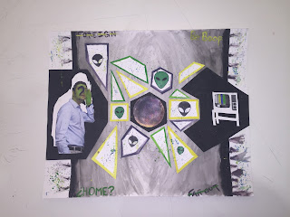
          For this Post Modernism Project, I combined digital image cut outs, Bristol cut outs, gouache paint and black ink to form my work. Of the gouache paints, I used green, yellow, blue and purple which make up a compound color scheme. I used this color scheme because many of the colors were already seen in the planet located at the center of the piece. The colors would also be a good contrast to the black and grey background that I used. I painted the background piece of Bristol with black ink: two inches from the edge I painted a thick black line and slowly faded the ink towards the center. In the blank two inches, I put streaked purple paint and splattered paint from my color scheme. On top of the background, I glued three pieces of black Bristol cutouts. Each piece has a digital image pasted on it, a man painted green with a question mark on his face, a purple and yellow planet, and a TV with color bars on it. By placing one piece to the left, right and the center, I display the rule of thirds in my composition. In between the three black cutouts, there are smaller white Bristol cutouts with a yellow, green or purple border. Six of the fourteen white shapes have an alien head on them. Splattered paint is also found all over the fourteen white shapes. In the four corners of the background ink, there are words, two of them are crossed out. 
          Mystery is the first connotative meaning that pops into my head when looking at this piece. The colors used are an odd set that are not really seen together anywhere besides space movies. The aliens in a movie are usually always green or purple, and they come from a planet that is grey or black. Placing these brighter colors against the grey background adds even more mystery to the piece because they are not always paired together.  Another emotion that comes up when looking at this piece is confusion. The man is looking and listening towards the other planet and the TV, but why? The white shapes in between the black cut outs, cut up the flow of the image, making your eye jump around. This makes the piece confusing and hard to decipher. The words Foreign and Far Out are written in opposite corners of the background and are crossed out. By crossing these words out, the viewer is confused because to them, aliens are foreign and far out, but the piece of art is telling them otherwise, or is it? Using a TV that does not have an actual image on it adds to both the mystery and confusion of this piece. Everyone knows that when these bars of color come up the channel is not working which makes you confused and wonder why it isn't working. The white shapes in the middle of the piece are not connected which makes me think that these shapes are orbiting around the center planet, like its moons. From this idea, you can also see the other two black pieces of Bristol as planets, making the piece a whole similar to a galaxy or solar system. The general idea of a solar system and space can also be seen as zoning out or daydreaming. 
          Zoning out can be used to describe the ideological meaning of this piece. People in everyday life zone out, but where do they go or what do they think about during this time? The answer is simple: it is a mystery to us. Nobody knows where they go, including the person that zones out. This is one of the few examples in which what we are thinking about is a complete mystery. Another ideological meaning could be that we as humans piece together small bits of information in order to understand a grander concept. Many planets make up a solar system in space, just like how there are many different parts of an idea. If you only understand some parts of the idea, the idea remains a mystery. Overall, people need to understand every piece of an idea in order to fully understand it, unless the person is zoning out which still remains a mystery to everyone (except for the aliens). 

Monday, October 31, 2016

Post Modernism Progess

          Pictured below is my current state of my Post Modernism project. While it does not look like a lot, it took a little while to get it to this point. I painted a Bristol sheet purple, yellow, and blue and painted other pieces of Bristol with black ink. With these three colors, I hope to make a compound color scheme. The black pieces are laid over top of the other piece of Bristol in order to create some contrast. I still have some painting left to do on the background piece, but the smaller pieces are all done. Cutouts from my Photoshop image are going to be glued onto the black pieces of Bristol. The images are going to be in color in order to make them stand out. I am still trying to figure out how to connect the three images so you can see the relationship between them. When this project is all done I hope to have projected a mysterious aura from the piece of art that clearly relates to my quote of choice. 


Sunday, October 30, 2016

The Art of Data Visualization

          The general idea of this video was Data Visualization, but it was broken down into individual parts throughout the video. The first quote that caught my attention was, "visualizations are a by product of the truth and goodness of the information." This means that the root to all the images and visualizations in the world are truthful facts and valid information. If the data is bad and not valid, then it is going to be difficult to make an image that people can understand and trust. This plays of another idea that was presented: the history of visualization data is a history of science. Science was used to come up with the data. If there was no data then there couldn't be any visualizations to go along with it. I agree with this statement because you can always make visualizations, but if they are not based off facts or data than the viewer has no content to go with the image. Another major aspect I found interesting was that these visualizations are built in a way that our sub-conscious brain activity can make split decisions off of them. Even though we don't know it, we interpret images in a certain way before we can even form words about them. Having linear patterns in these visualizations makes our decision making easier and faster so we can process more information in a shorter period of time. The quote that I thought was most powerful in the video was, "See to learn not to confirm." What this means is that you should look at data visualizations and learn new things, not confirm things you already know.  Maps, trends and pie charts are just a few examples of data visualization that people use. We do not think of these things as data but all three of them help us interpret a large amount of information with ease. There is so much data in the world that data visualizations help us learn new things in every day life whether we realize it or not.
          Data visualizations are similar to art because there is information behind them that drives the image. In art, it is often an emotion, a story or history. In data visualizations, it is obviously data. Even though art and data visualizations don't look the same on the surface, they are much more alike than you think.

Thursday, October 20, 2016

Jameson and Baudrillard Readings

Jameson Reading 
            Reading the first article presented some difficulty for me. I was able to understand the general concepts about how the conversion to postmodernism changed a lot about how that art was set up and what it meant. The example used in the article was images of shoes. The first one was painted by Van Gogh. In his image, there is more detail which presents more emotion, depth and interpretations of the simple frame. Because of the detail you are able to create a background story for the image. Unlike Van Gogh's shoe painting, Warhol created a much simpler image. This image represents the postmodern era. Because Warhol's image is so simple, it takes away the emotion, depth and multiple interpretations of the painting: it is just a snapshot, not an elaborate story like in Van Gogh's painting. I find it interesting how the era you are in effects the way you interpret art. It also makes me wonder why certain eras occur when they do, and what brought about the changes in art to get to that specific era? 

Baudrillard Reading 
            Disneyland was the example used in this reading in order to showcase the ideas of hyper-reality and imagination. The reading talks about how Disneyland is a place where you can let your imagination come alive. Because you are submerged in a world that feels so real, you understand the things going on around you to be your reality. The things outside of your reality (Disneyland) become unimportant and feel like they don't even exist. This idea showcases that reality and the imaginary can be switched. I believe that the take home point of this article is that the basis for most art is the ability to find a balance between our imaginations and our realities. Our imagination is the creative aspect of the art, while reality is the ability for us to translate our imaginations into art for others. Adding a little creativity and imaginations to our reality allows us to stay youthful and experience things as if they are actually in our reality, like Disneyland. 

Thursday, October 13, 2016

Subvertisement


Below is the subvertisement I made for a nutella ad. In the original ad there is a list to the right of the jar that says all the things that one jar of nutella can go on. In my subvertisement I added another list of item to the left of the jar: these are the "bad" things in nutella. I also added a question at the bottom which states: What's more important: what's in it, or what you put it on? These changes were made in order to expose the fact that nutella is not as healthy as the company says and just because you put it on something "healthy" doesn't make it good for you. 


Wednesday, September 28, 2016

Ways of Seeing

          Overall, I thought this article was interesting, but confusing at times. While I was able to understand the general concepts of the article, the more specific concepts became a blur to me. Despite that, I found two ideas that I found really interesting and thought-provoking. 
          The first one being, "When the camera reproduces a painting, it destroys the uniqueness of its image. As a result its meaning changes. Or, more exactly, its meaning multiplies and fragments into many meanings" (Berger 19). I never really thought about this concept before: how you interpret a painting depends on how and where you see it. Berger then continues on to talk about how a painting on your television screen, has a diversified meaning because it is being projected in a new medium (a screen) and it is now surrounded by different things. In one house the TV could be surrounded by wallpaper and pictures and books, while in the other it is surround by a blank wall. Each family sees the same image but will have a different understanding of the painting because it has a different backdrop. Even though this idea doesn't seem to have a lot of relevance, in the art world, it does. Artists chose to stage their art, painting or drawing in a certain way so that the audience understands its meaning in a certain way. When the setting varies, new and incomplete meanings can come from the artwork.
          On page twenty-three, Berger brings up the idea on how a painting can be more impressive if it has a high market value, "It became famous because an American wanted to buy it for two and a half million pounds. Now it hang in a room by itself." I don't really agree with this concept even though it is true. Just because one painting costs more than another doesn't mean it should be more famous or have a more important meaning. The example used in the text is a painting being put behind bullet-proof perspex. It says that it has " a new kind of impressiveness". This impressiveness comes from the value that is behind the canvas, not what is physically on it or what it means/represents. This is intriguing to me because there isn't any reason that a painting is more special than other, maybe the artist who painted it is more famous than another, but all paintings have their own special meaning which means they all have a special value, it just depends on your interests and beliefs. 


Monday, September 19, 2016

Perception of Light: Julio Fine Art

          On Thursday the 15th, I attended the presentation of Carol Miller Frost's Perception of Light in the Julio Fine Arts Gallery. I looked around at the canvases and didn't really have any emotion. It looked like there was just a single color painted on a canvas. I was confused by this, asking myself, "What makes this so special?" But as I moved around the gallery and took a closer look at the paintings, I noticed their detail. There were different shades of the color, geometrically blended into the main color. These little details were able to catch the light, giving me a new perspective of the painting. Like Frost says in the pamphlet, "...they are non-figurative, geometric in structure and provide no clue as to meaning." I find this quote interesting because a lot of artists want their art to have a specific meaning, but Frost doesn't. I guess leaving the interpretation up to the audience is a good thing, because they can connect to the art in their own way, instead of being forced to accept an idea. My favorite piece that was in the gallery was called Deep Red. This piece was my favorite because of the color used. All of the other paintings were relativity bright in color, but this one was dark. I also liked it because even though it was a dark color, Frost's technique brought out the lighter side of the color. The colors and title's used were all a reflection of how she perceived art in her own studio. Every painting that was in the gallery, was an experience that Frost went through: each canvas was a different one. At first this gallery did not appeal to me, but with time I found it interesting.


Sunday, September 18, 2016

Trip to the Baltimore Museum of Art

While at the Baltimore Museum of Art, three works of art stood out to me. The first one being Nude by Henri-Edmond Cross. This piece of art depicts a nude woman, slightly covered by a blanket, who appears to to be lying in the forest. Cross used many different colors in order to capture the essence of the forest. I noticed that the colors he used for the ground are not natural. What I mean by this is that it isn't green or brown like in real life. It is pink, purple and yellow. I enjoy this detail because it bring more character to the painting. Another technique Cross used was dots. The brush strokes in this painting are short and choppy creating a dot shape. Using many dots to form the image brings in texture and more character. 


The second piece of art that caught my eye was Figures and Birds in a Landscape combined with Personages Attracted by the Forms of a Mountain by Joan Miró. I would classify both of these paintings as abstract. They depict people and animals through different shapes and colors. I like both of these paintings because since they are abstract, there are many interpretations of them. Basically you can never be wrong. One of the major things that caught my interest was the explanation behind the top painting, The figures in this painting are twelve small works that reflect "Miró's apprehension on the eve of the outbreak of the Spanish Civil War." I find this interesting because it creates a personal time stamp for the artist. Miró, as well as others, can look back at this painting and interpret how Miró felt right before the Spanish Civil War broke out. The painting turns his emotions and thoughts into figures and shapes which is very interesting. 


The third piece of art that caught my eye was Self-Portrait by Andy Warhol. This painting immediately caught my attention when I walked into the big, open room. It has an aspect of mystery that intrigues me. An example of this is the two sets of eyes that are present, one set is pink, the other is black. I also like his use of the color pink. Against the black it really pops and makes his face easy to see. Another piece by Andy Warhol that I liked was the painting Rorschach. Even though it is simple, it is intriguing. It reminded me of when I used to fold my paper plate paint pallet when I was done with it in elementary school. It is another abstract piece, which is something that I like. Putting the black paint on the gold background, makes it eye caching, just like Self-Portrait. Warhol's use of color is what I find most interesting about his works. 


Even though I enjoyed all of the art I saw in the museum, my favorite painting was Nude by Henri-Edmond Cross. This painting is my favorite because of the technique and colors used. The colors are warm and brilliant; every time you look at them you see a new shade. The use of dots also makes this painting my favorite. Making every one of the marks must have taken a long while, but each one tells a story. The dots add appeal and character to the somewhat simple image of the woman. All of Cross' other works, have the same dot aspect which I really like even though they are all simple. Cross' work is also my favorite because in order to paint using dots, you must be patient and creative, (two things I am working on), so I admire him for that. 

Sunday, September 11, 2016

Visibility

          As I read through the article, there were many parts that were difficult to understand. I was not familiar with many of the illusions and references the author made because the complex ideas seemed foreign to me. Despite the difficulty that I had with the article, I found a few of the main points very intriguing.
          The first one being the two types of imaginative processes: words to images and images to words. I found this interesting because I did not realize that connecting words and images is something that we do everyday. When we look at an image, we use words to describe what we see. When we read words, we use our minds to create an image in our heads. Regardless of the medium that you start with, the end result is a stimulation of our imagination.
          Another part of the article I found very intriguing was when the author said, "What I think distinguishes Loyola's procedure, even with regard to the forms of devotion of his own time, is the shift from the word to the visual image as a way of attaining knowledge of the most profound meaning" (86). What I believe this means is that when you leave words up for interpretation, many different images can arise as no one imagination is the same. Because perspectives and interpretations are all different, it allows for a variety of possibilities that are distinctly unique, yet important to the understanding of the same words and images. This concept makes the idea of art and imagination special because the experience is rarely the same for people.
          The most captivating part of this article for me was when the author said, "We are bombarded today by such a quantity of images that we can no longer distinguish direct experience from what we have seen for a few second on television" (92). I strongly agree with this quote because the many advances in technology have impacted our lives in this technology driven society. Currently, kids mimic what they see on T.V. and online instead of thinking of things to do themselves. Technology is slowly becoming the center for all of our ideas and taking the place of a lot of our imaginative processes.

Wednesday, September 7, 2016

The Whole Ball of Wax

          In his article, The Whole Ball of Wax, Jerry Saltz discusses how art has the ability to change the world and how important it is to realize its full potential. Even though I generally agree with Saltz's article, one point that I strongly agree with is that, "Art is an energy source that helps make change possible..." (1). Just like any other subject in school, art has the power to teach people about history, the future, emotions and so much more. You just have to know and try to understand the deeper meaning of the art, not just the meaning that appears on the surface. 
          I believe that people often overlook or misinterpret art because all they see is the surface: the colors, the textures, and the shapes. Saltz brings up the point, "...when we look at art, we're not only looking at it; we're also looking into and through it, into and through the paint, pigment, canvas, or whatever to something else." (2). The image or object that is on the canvas or paper represents something so much more than the still frame. It represents the ideas flowing through the artist's mind, the time it took for the artist to create it, and the society around them at the time. Like Saltz says, "it [art] exists within a holistic system": it represents a whole not just a part (2). I find it very intriguing that one piece of art can distract or change a person because it can represent so much more than what is right in front of them. 
          This article gave me a new respect for the potential that art can have. In life and specifically in this class, I will work towards understanding the background and deeper meaning of art that is in front of me. The one question I have is, how do we go about trying to understand that deeper meaning in a piece of artwork? Should we look up the history behind it or just take our time with the piece in order to absorb ever piece of it and try to understand the deeper meaning?